With the recent launch of our annual Design Trends Look Book, we wanted to dig a little deeper into each of the three design trends that align with the latest influences in interior environments and how Crossville tile collections answer these trends. The trends are derived from three core design tenets: timeless luxury, era of contrast, and outdoor living.
Emerging from lockdowns, we seek wellness, restoration of balance, and reclamation of literal and figurative breathing room. As the pendulum swings between the desire for safety and freedom, design trends responsively echo the contrasting perspectives. The result is a prevalence of visually divergent designer hues.
Color Wheel Opposites
What does that look like for the design industry? How does health and wellness balance with excess and indulgence? We really like to treat ourselves per the previous trend of Courtly Conduct, and no one likes to say no to themselves. So, what does that mean in interiors? High-contrast interiors are polarized right now. The trend shows very high-contrast interiors and white, and it’s not just white, it’s not sterile, it’s white with deep, rich colors.
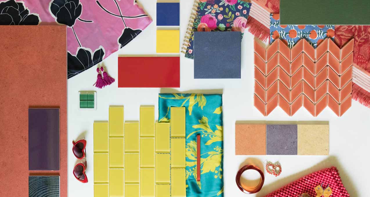
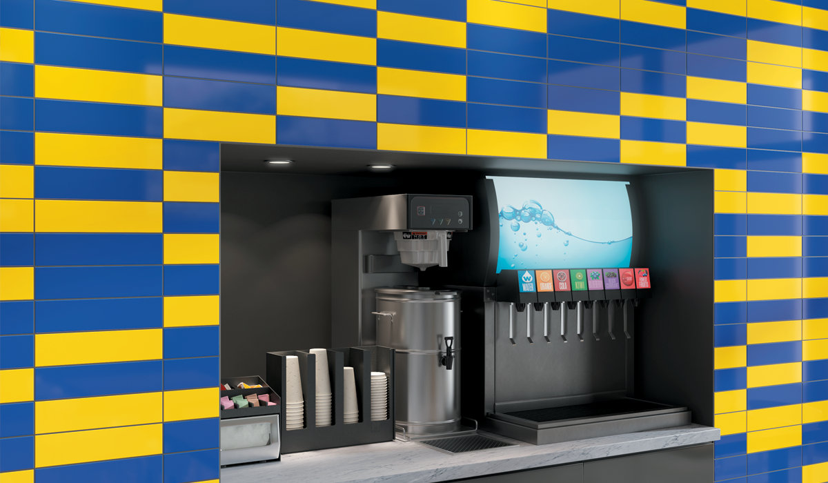
So, it is color wheel opposite. We’re not looking for complementary; we’re looking through bold, big splashes of optimism in our decor. So red, green, purple, yellow, blue, and orange all come together. It is bright, but it is sophisticated.
 Convergence – Indigo
 Swatches – Brilliant Deduction Cobalt and Pineapple
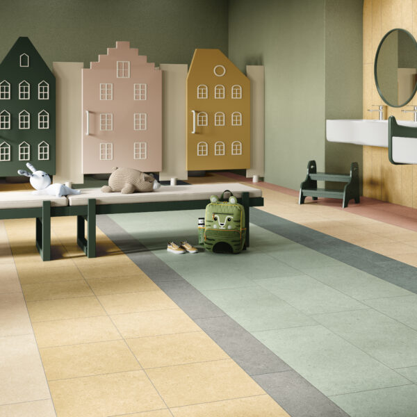
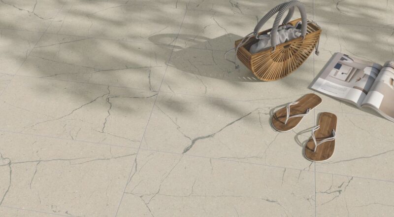
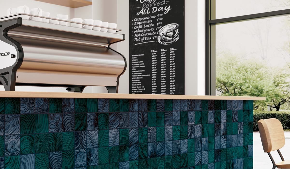
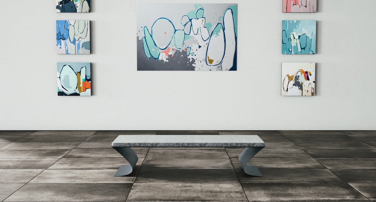
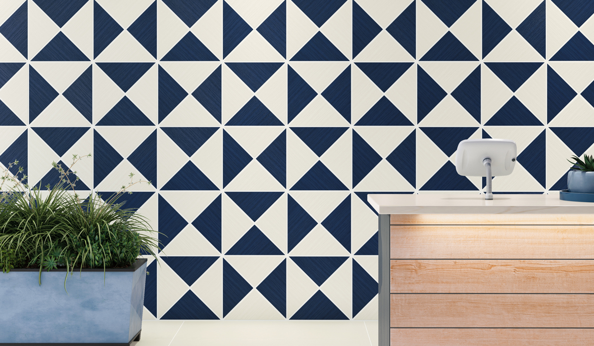
White and Deep Color
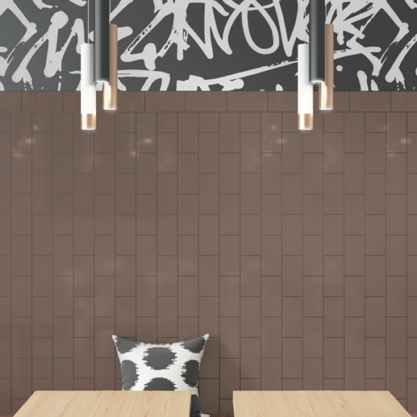
In the Courtly Conduct trend, we talked about the Baroque with rich color. This era of contrast is kind of the evolution of the modern farmhouse. It is clean white with a very organic style but highlighted with deep punctuations of dark green, blue, and black. And in tile, we see traditional black and white tile, but some very graphic geometrics, bold blues, rich blues, rich reds, as well as patterning.
 Reformation – March On
 Ardesia A Spacco – Bianco
Shades 2.0 – Midnight
 Owen Stone – Teddy
Each of the three design trends is expanded in Crossville’s Design Trends Look Book. With coordinating tile options for each of the trends, the new Look Book is a tremendous digital reference tool.
Find the full book via this link.
Crossville’s VP of marketing, Lindsey Waldrep, researched today’s design trends from a holistic perspective that factors in the broad societal and fashion influences that guide current aesthetics for commercial and residential design. She first presented her findings as part of a global trends panel discussion at the 2022 Coverings Expo.
Video Transcript
Excerpt from Coverings 2022 Global Trends Panel Discussion with Lindsey Waldrep
So then the next tenet for the show is wellness and the environment. And this one was really interesting because I feel like we’re in an era of contrast when it comes to these things. And what does wellness look like for us now, two years later after we all have to go home and you know, we’re starting to emerge and what does that does do for us psychologically and how does that really to our interiors and tile?
So we’re in a place of contrasting values. You know, the pandemic stress has got us trying to learn how to balance safety for our health and freedom. We wanna get out, we wanna go do things. We wanna do it as safely as we possible at the same time. We’re in conflict because we’re reassessing what want and need in our lives. Is it quality versus quantity? And quality is beginning to surpass, which is a wonderful thing for this industry. Digital and physical are what’s entangled in our virtual lives and then our real lives. You know, when we got together as a group, some of us haven’t seen one another in person in over two years, it’s so good to see one another in real life. And yet, we were also discussing how we did this last time with zoom and, and all those different ways that technology is starting to blend.
And what does that look like for the design industry? And then health and wellness is gonna balance with excess and indulgence. Let’s face it, we really like to treat ourselves per the previous slide and if no one likes to have to say no to themselves. So how do we balance that healthiness, that wellness, you know, from our Pelotons with a box of chocolate nearby? Just say, I have actually used one of those with a bowl of ice cream before, and it made me feel really good. So was does that mean in interiors? (And thank you for laughing). High-contrast interiors, we’re polarized right now. And so we’re seeing that in very high-contrast interiors and, and white was one of the things that Elena spoke about in February, and it’s not just white, it’s not sterile, it’s white with deep, rich colors.
And we talked about that a little on the Baroque, this to rich color. This is kind of the evolution of modern farmhouse. Scandi-Japani, this white cleanness, organicness, but highlighted with these deep punctuations of dark green and blue and black. And tile, we see that, you know, both as is traditional black and white tile, but some very graphic geometrics, bold blues, rich blues, rich reds, as well as patterning. Portobello America’s tile on the far left has that patterning to it. Interceramics on the right has texture to it that goes into some of that maker movement. And then we have Daltile and Crossville in between with bold, rich colors. So that’s how we’re gonna apply that trend with tile. And then, on the opposite spectrum, white, we over it. So it’s color wheel opposite. We’re not looking for complimentary., we’re not looking things for things to be seeding, we’re looking through bold, big splashes of optimism in our decor. So red and green purple and yellow, blue, and orange all coming together. It is bright, but it is sophisticated. So in tile, we see that here, the blue and all the yellow and purple, the red and green, and the top of the far left is actually this really beautiful Juniper kind of color. So the greens are running the gamut and we’ll get into that a little bit.