Colors for Learning Environments
In learning environments such as classrooms and study areas, color is important for creating an atmosphere that promotes concentration and focus.
Blue
Often associated with feelings of calmness and heightened concentration, blue hues have been shown to reduce anxiety and increase productivity. Colors in the blue spectrum are ideal for stimulating clear thought and focused attention, particularly in subjects like math and science.
 Crossville® porcelain slab in Femme Fatale on desktops and Armstrong Flooring™ Terra™ LVT.
Green
Green is known for its calming effects, promoting relaxation and reducing eye strain. Shades of green are particularly beneficial in environments where students spend long periods reading or using computers.
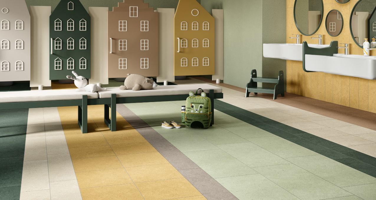
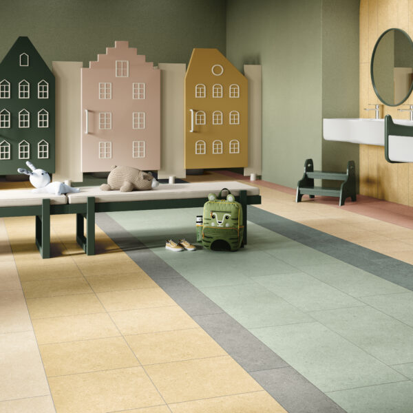
 Argent 2.0™ porcelain tile in Winter Garden, Golden Glow, Enchanted Forest, Silver Sage.
Off-White or Pale Gray
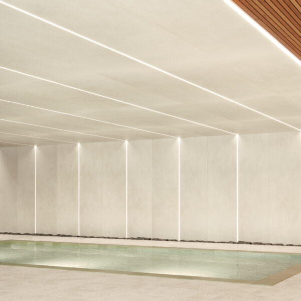
Neutral colors such as off-white and pale gray are less distracting and can evoke a feeling of spaciousness and tranquility. They help maintain focus and reduce feelings of being closed in or overwhelmed.
The porcelain tiles designers chose for a Texas school have a tactile quality that highlights the project’s biophilic principles and encourages interaction through touch. The calming, neutral color palette also contributes to this effect. Shown here is Calce Porcelain Panels by Laminam® in Bianco on a curved wall. The line is inspired by wet plaster and concrete. Read the case study. (Architect: Perkins Eastman, Photograph by Andrew Rugge, copyright Perkins Eastman)
Colors that Enhance Spaces for Exploration
Exploration spaces are designed to stimulate creativity and foster dynamic thinking. These are spaces such as art rooms and interactive learning centers.
Yellow
Vibrant and invigorating yellow can stimulate mental activity and inspire creativity. It is an excellent choice for art spaces or any area where creative exploration is encouraged.
 Wall: Crossville Swatches™ wall tile in Brilliant Deduction Cobalt BRI21, Brilliant Deduction Pineapple, Necessary Objects Cotton
AHF Contract Highlights™VCT | Santorini Blue HR003, Olympian Gold HR015, Delicate Glow HR014
AHF Contract Iliad™VCT | Dynastic White CR001, Imperial Black CR006
Armstrong Flooring Imperial® Texture VCT | Blue Cloud 51933, Blue Moon 57535
Orange
Orange is an energetic color that evokes feelings of excitement and enthusiasm. Shown to stimulate critical thinking and creativity, orange is a fantastic color for environments where problem-solving activities and collaborative work take place.

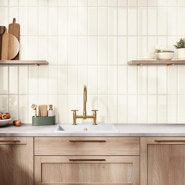
Color Perspectives™ ceramic wall tile in Pollen and Marine
Colors for Introspective and Calming Zones
These zones are carefully crafted spaces designed to promote calmness, self-reflection, and personal activities, such as cozy reading corners or sanctuaries dedicated to mental well-being.
Soft Blues and Greens
Soft blues and greens evoke a sense of tranquility and peacefulness, creating an atmosphere that encourages relaxation and is conducive to relaxation and introspection. They can help soothe the mind and encourage reflective thinking.

Walls: Crossville Calce porcelain panels in Avorio, and Crossville Color Perspectives™ wall tile in Tea
Floor: Armstrong Flooring Nidra™
Lavender
Light purple tones such as lavender are associated with spirituality and calmness. Lavender can be particularly soothing, and because it can help facilitate a peaceful state of mind, it’s an ideal color for spaces dedicated to mindfulness or relaxation.
Earthen Colors
Earthy tones, such as rich browns and soft beiges, have the power to anchor a space, evoking a sense of safety and security. Designers will often choose these hues for areas that are intended to provide emotional stability and a sense of grounding.
 Wall: Crossville Shades 2.0™ porcelain tile in Vapor and Warm Grays mosaic on wall
Floor: Armstrong Flooring Biome™ LVT
Implementing Color Strategies in School Design
Color Intensity
The intensity of a color affects how it impacts a space. Brighter colors tend to be more stimulating and are most suitable for active learning environments. Softer shades, on the other hand, are better suited for areas where concentration and a sense of calm are desired.

Argent 2.0™ porcelain floor tile in Memphis Blue and Golden Rod
Creating Balance with Color
Combining colors can be a powerful tool for creating balance in interior designs, especially in school environments. Incorporating vibrant colors for accent walls, for example, can effectively harmonize with neutral backgrounds, offering visual interest without overpowering a space.
 Walls: Crossville Color Blox 2.0™ porcelain tile in Cayenne, See the Moon, and Cotton Sheet
Flooring: Armstrong Zenscape™ Heterogeneous Sheet, Armstrong Flooring Exchange™ LVT
Adaptability
Adaptability takes into account the age and activities of the students. Brighter and more varied colors can benefit younger children in certain spaces because they capture attention and create an engaging learning environment. In contrast, older students often benefit from more subdued tones that help reduce distractions and promote better concentration during their studies.

Wall: Crossville Shades 2.0™ porcelain floor and wall tile in Whites Mosaic.
Floor: Armstrong Flooring Medintone® Homogeneous Sheet and Armstrong VCT Feature™ Tile.
Strategic use of color can significantly enhance the educational experience, influencing everything from mood and mental clarity to energy levels and creative capacity. Through mindful color selection, education designers can create environments that support both academic success and overall well-being. Crossville® offers a plethora of tile collections in on-trend trend hues to help designers realize their visions for school design projects. Visit Surfaces for Schools.
Love What You See? Great Design Starts With a Sample!
You can quickly and easily order a sample of any Crossville tile through Crossville’s Sample Express. To quickly order free tile samples, just set up an account here to get started. Once you have an account, ordering a tile sample is as simple as clicking a button — and samples are always free.
Other Great Reasons to Set Up an Account
- Save your favorite products and resources
- Create and organize projects
- Review sample order history

