The timeless luxury tenet gives birth to the Courtly Conduct trend. Because we have lived the past two years in a retracted space, treating oneself is a bit of an overdue indulgence. People feel the need to celebrate where we are right now, and they feel the need to escape. Courtly Conduct is a two-pronged trend providing lavish escapism. Inspired by the audacious styles of two popular TV shows, The Great and Bridgerton, the Courtly Conduct style evokes the grandiose elegance of Baroque 18th and Regency 19th centuries.
Courtly Conduct, Baroque Style
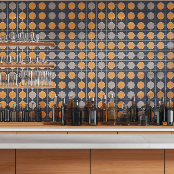
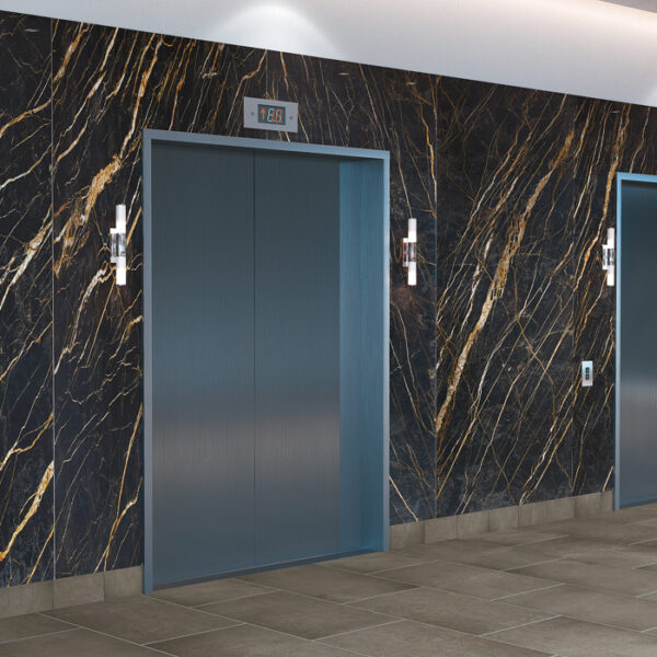
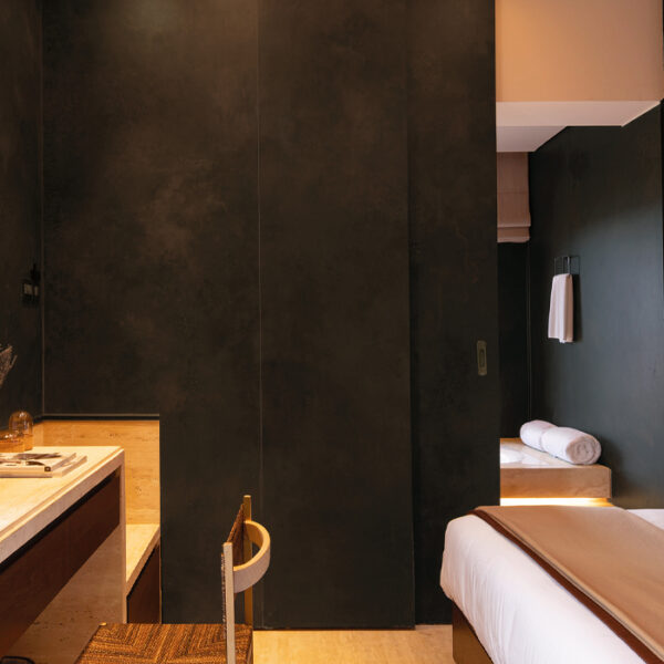
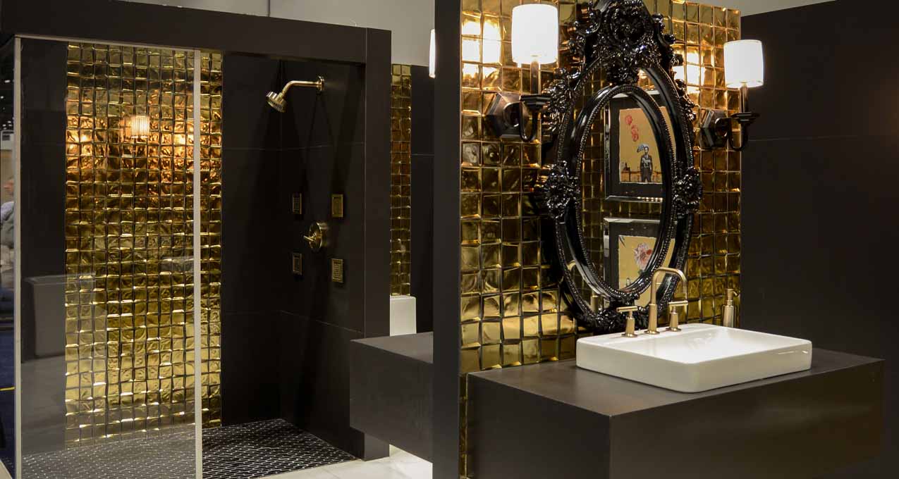
The Great, based on Catherine the Great of Russia, offers viewers a look at the Baroque style. With palatial architecture inspired by the grandness of Versailles, you see sets awash with mirrors, white and gold, and deep, dramatic, rich colors throughout. So, what does Baroque look like in a modern aesthetic? We see a lot more grandeur, a lot of woodwork, and white and gold with dark stone and dark colors coming into play on the lighter side. On the dark side, we see those deep, rich hues like teal with gold, charcoal, and hints of pink and gold, but with a lot depth. In tile, modern Baroque is really about hyper-luxe materials that we haven’t been able to get or afford before, such as dramatically veined porcelain panels, richly colored tiles, and mirrored tiles. Here’s a look at some Crossville tiles that align with the modern Baroque trend.
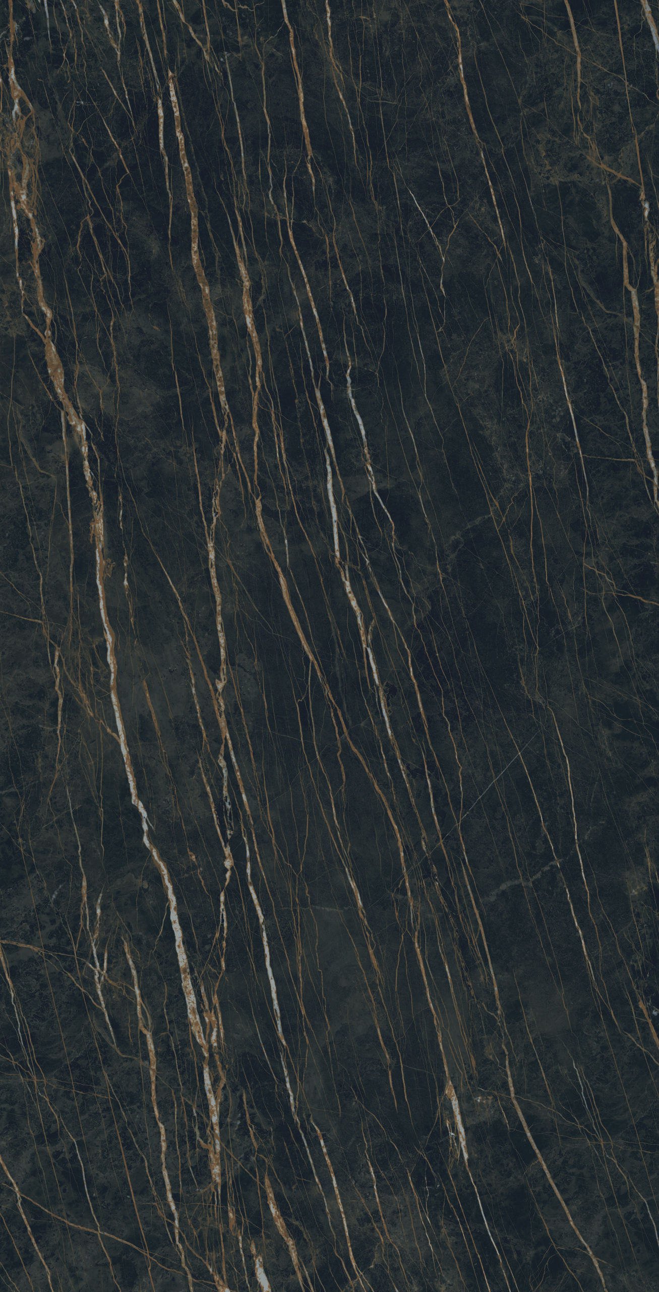
Cava Noir Desir
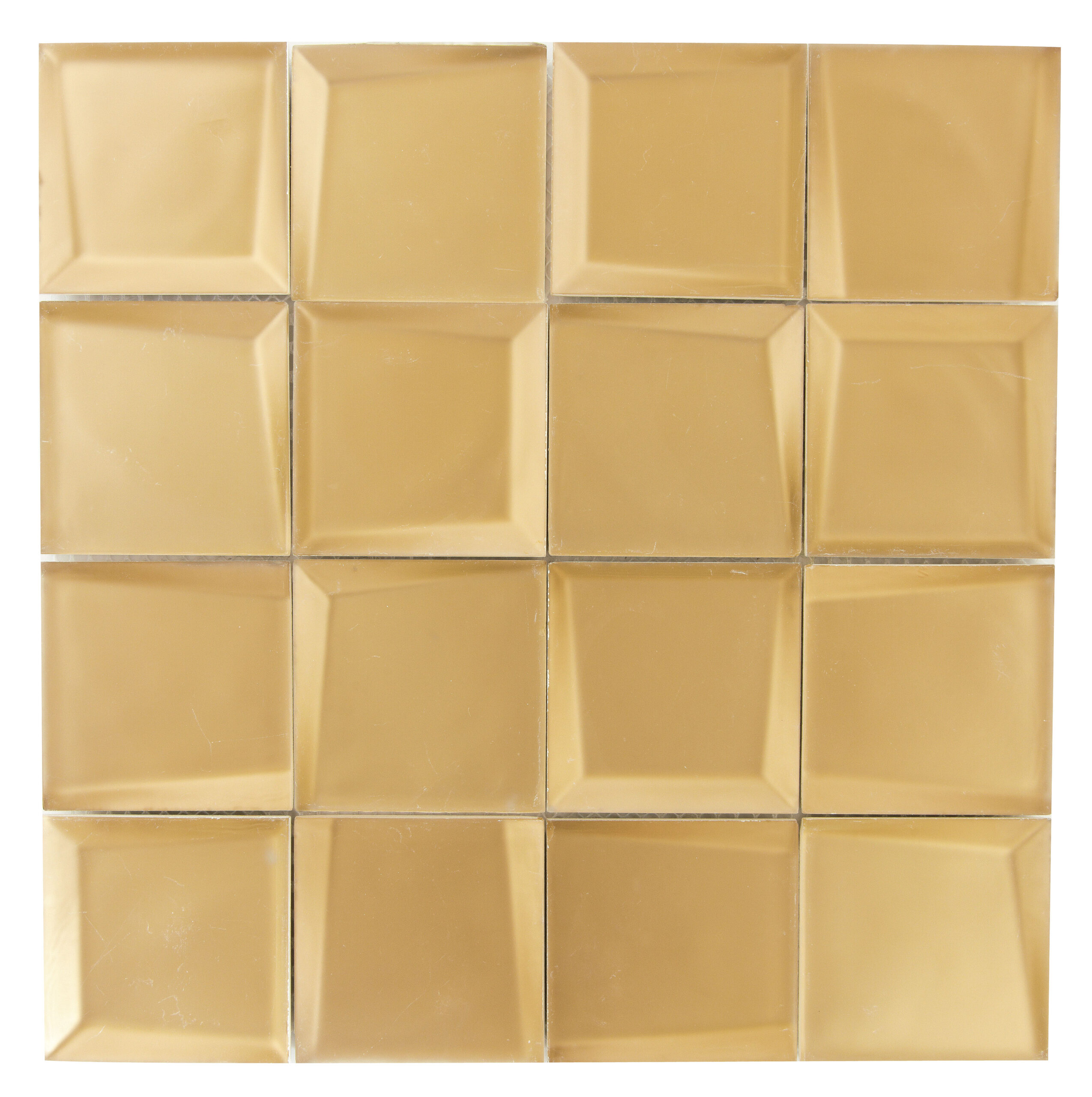
Sideview Gold
Shades 2.0 Ink
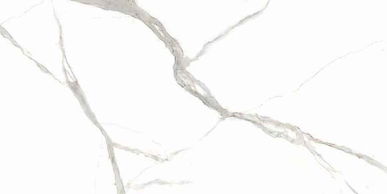
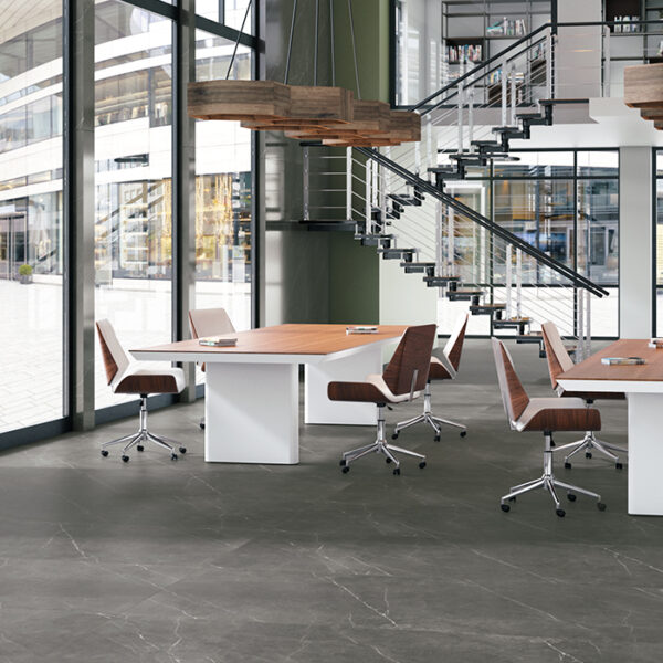
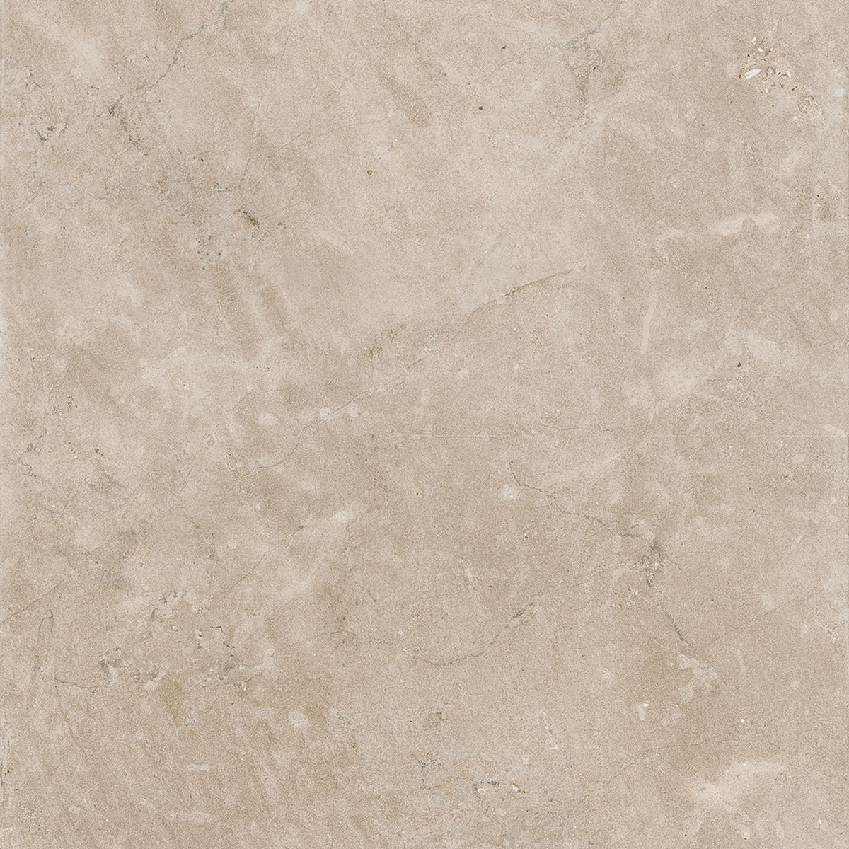
 I Naturali, Calacatta Michelangelo
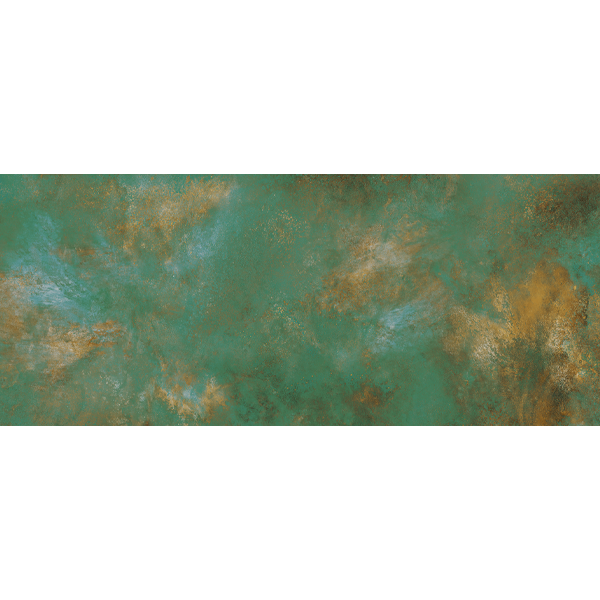
Ossido Verderame
Courtly Conduct, Regency Style
Queen Charlotte reigned during the Regency era, the period portrayed in Bridgerton. Forty years after the baroque period, we see interiors that are lighter or brighter. we still find gold and pattern, but they’re mixed with pastels now. We find huge windows with over-the-top draperies, but not so much layering. Maximalism becomes light and bright and happy. In today’s Regency influence, we see symmetry and grace, large windows, and crystal chandeliers in place of gold, but we still see some gold with pastel colors, like pink and coral with pistachio mixed in.
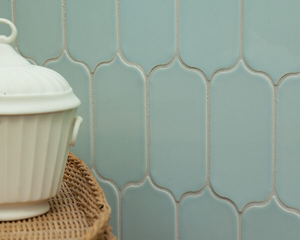
What does Regency look like in tile? We still see porcelain panels, but not as heavily veined, not as dramatic. The stone looks are much softer, with subtle veining, and there are lots of pastels, especially in wall tile. Here’s look at some Crossville tiles that answer to the regency trend.
Cursive Rose Gold
Handwritten Par Avion
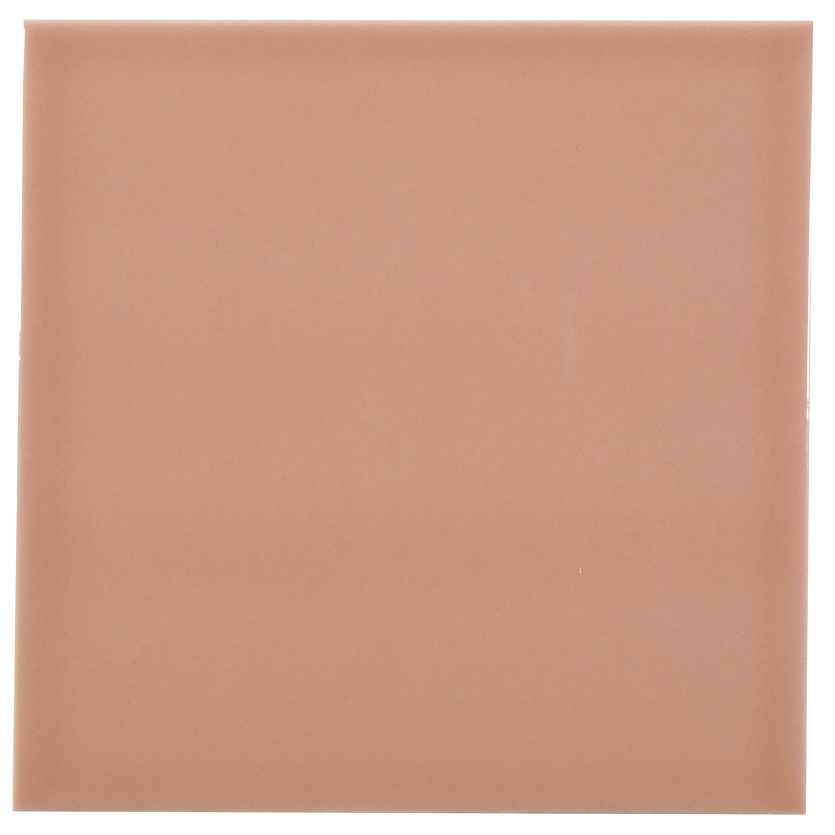
Portugal Grand Rose
Each of the three design trends is expanded in Crossville’s Design Trends Look Book. With coordinating tile options for each of the trends, the new Look Book is a tremendous digital reference tool.
Find the full book via this link.
Crossville’s VP of marketing, Lindsey Waldrep, has researched today’s design trends from a holistic perspective that factors in the broad societal and fashion influences that guide current aesthetics for commercial and residential design. She first presented her findings as part of a global trends panel discussion at the 2022 Coverings Expo. Video Transcript:
Excerpt from Coverings 2022 Global Trends Panel Discussion with Lindsey Waldrep
The Baroque and Regency trends begin at 2:17.
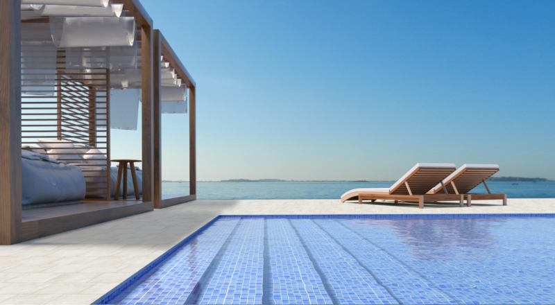
Good morning, everybody. So yes, the way that we do this, how many of you have, have been to one of our trends talks before? Do I have most? Okay. So I see a couple of hands raised. Thanks for coming back. That means we’re giving you stuff. But what we like to do, or what I like to do is really talk about interior design trends, because I think it’s very important from an industry perspective, to see where the products that we make, what we sell, what we install fit into the overall scheme of interior design in north right now. So I do come from Crossville, but today I’m speaking on behalf of TCNA and all of its members. So as we go through this, you’re going to see products from all over north America in the presentation. The show itself here at Coverings has three core tenants of design that they really want us to focus on this year, timeless luxury in the environment, wellness and outdoor living.
So I’ve taken those tenants and kind of looked at them under a, a little bit of a microscope to see what that actually means. If you tuned in to Elena’s presentation for Coverings Connected back in February, we’re going to hit on some of the micro trends that she’s talked about and how it all ladders up to these three core tenants. So you guys are ready to go? Yep. Every ready everybody’s caffeinated. Okay. So the first thing we’re going talk about is Courtly Conduct, and that goes under timeless luxury and in interiors inspired by two very royal queens. And I love this picture. I think it’s very appropriate for, for where we still are right now. And it’s funny. But the inspiration…where is this coming from? History meets pop culture in new forms of entertainment maximalism, so that trend of layering and very over-the-top interiors continues to trend up. Technology is really allowing for vivid reproductions and some of the world’s most luxury is materials, including tile and stone.
Treating oneself is a bit of an overdue indulgence. We’ve been living for two years in a very kind of retracted space where we really feel like we need to celebrate where we are right now, and then everyone needs to escape. So a little mind candy is on top of everyone’s mind right now. That image, by the way, is from this Spring’s Jimmy Choo bridal campaign. So it’s about the shoes, but I want you to make note of the interiors and the white and gold, because our first trend that Elena went over in February is Baroque style. Now how many people have over binged on Netflix and know what this image is? So anybody know what this show is? Okay, I see one or two. There’s a show on Netflix, that’s in season two, in case you want to check it out, called “The Great,” and these are some examples of the great sets.
Now, Catherine, right, was an Empress. She did not build her own palaces. She inherited them from her father-in-law, and her father-in-law’s architect was very inspired by Versailles. He created his own Hall of Mirrors, loved all the white and gold from the French, loved these deep dramatic, rich colors throughout his palaces. And because this TV show is now on Netflix (The Great), we’re all getting exposed with a little bit of living room-mind travel, if you will, to some of those places. And it’s actually inspiring the interior design community. As I said to start out, pop culture is one of the reasons. So what does this white, gold, rich colors mirrors look like in today’s design? Well, this is kind of what Baroque’s looking like in a modern aesthetic. Now you’re gonna see some things in here that might look a little ArtDeco to you, which is a trend we’ve talked about in the past, but this scale is different — instead of small geometrics, we’re seeing a lot more flow.
We’re seeing a lot more grandeur. You’re seeing a lot of woodworking again, that white and gold and dark stone and dark colors coming to play on the lighter side. And on the dark side, you’re seeing those rich, rich colors. Again, the teal with the gold charcoal, gray, also a hint of pink and gold, but a lot of depth. And these are definitely those maximalist interiors that I was mentioning. So what does this look like in tile? Right. So modern Baroqueis really about hyper Luxe in materials that maybe we wouldn’t be able to get before or couldn’t afford before. So you’ll see some porcelain panels in here, the long skinny three by twelve handmade looking tile in between them. I don’t know if it’s reading on screen, but it’s actually a really, really rich teal. And that comes from Interceramic. You’ve got mirrored tile for Crossville and Daltile on there.
And I love this mother Pearl from Jeffrey Court and the powder tile from Pratt and Larson. So if you wanna go Barque, someone comes into your shop with some of these pictures or, or loves this style, this tells you kind of where to take them on their shopping and selection experience.
Now, the other queen is Queen Charlotte and Regency style. It’s a little bit of a history lesson here. About 40 years after Catherine, the great, we go over to England. Charles II is reigning. Charles II was a little crazy. And so his wife and son ruled for 20 years and as the prince regent, and during that, that would be called England’s Regency period. Now there’s that little TV show that a lot of people are talking about. Again, season two just launched, Bridgeton. Bridgeton is so pop culture, it’s created a reality TV dating show.
I just got an email from one of the clothing companies online that I like asking if I wanted to dress in the Bridgeton style. So this is everywhere. If you’re not watching, this is some of the Regency that we see there 40 years later, more lighter or brighter, there’s still gold, there’s still pattern, but it’s mixed with pastels. Huge, huge windows, over-the-top draperies, not quite as much layering. So we’re backing a little bit off of that maximalism into something that’s light and bright and happy. So what does that look like when we’re not on the set of a hit TV show? This is today’s Regency influence. So you see symmetry and grace, you see large windows, clear crystal chandeliers instead of the gold, but still some gold and those pastel colors. You see a lot of pink and coral and pistachio next in. I know some designers feel like the gallery wall is out and we’re looking for big statement pieces of art, but not when it comes to Regency.
We want to see that and we love a good gold frame here. So examples of what that looks like in a decor. And then what does that look like with tile? You’re still gonna see your panels, but they’re not gonna be big dramatic tile, veining, much softer, much more subtle natural stones with more subtle veining to them and pastels a lot, a lot of pastels, especially in your wall tile. So we have a mix from Portabello, Interceramic, Pratt and Larson, Dal, and Crossville on this particular slide, all TNA members. So those are our two timeless luxury trends here, Regency and Baroque.