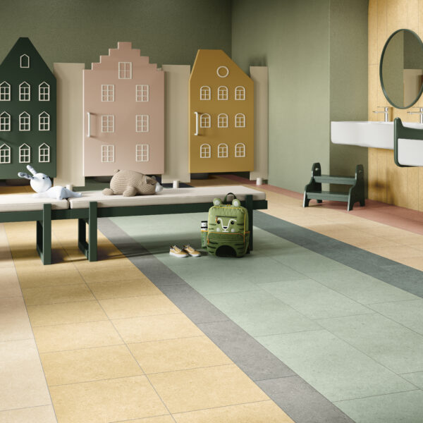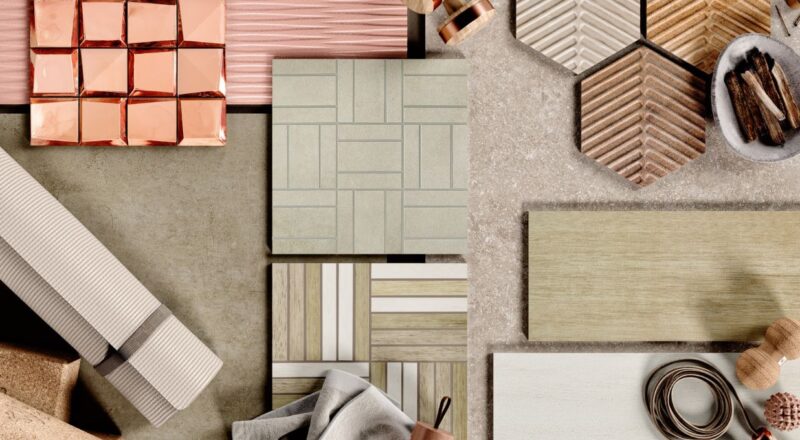
It’s the most colorful time of year in the design world. That’s because many paint manufacturers have just revealed their “colors of the year”—the hues they forecast we’ll be seeing more of in 2019. Several colors of the year have been announced over the past few weeks (the highly anticipated Pantone Color of the Year won’t be revealed until December), and the round-up thus far is quite different from last year’s range of tones, including an emphasis on shades of black. 2019’s chosen colors are very approachable, with a spectrum of shades from warm and earthy to rich and luxurious. Here’s a look at the trending hues for 2019 and some of Crossville’s tile collections that align with them.
Sherwin Williams’ Cavern Clay
A warm terracotta with “elemental roots,” Cavern Clay is a nod to midcentury modern style. It also has an American Southwest vibe. The warm, earthy hue is both cozy and sophisticated, which makes it work well in casual and refined settings.
“Cavern Clay is an easy way to bring the warmth of the outdoors in. Envision beaches, canyons and deserts, and sun-washed late summer afternoons—all of this embodied in one color.”

Triangular shapes and warm, rich and earthy hues are characteristic of both midcentury modern styles and designs influenced by the American Southwest. Our Groove Glass mosaics in Conga truly capture the spirit of Cavern Clay!

Behr’s Blueprint
Warmer than denim but softer than traditional navy, this mid-tone blue is approachable, visually appealing, and calming.
“It symbolizes our desire for positive energy, stability and confidence, both at home and out in the world.”

Look no further than our new Retro Active 2.0 in Royal Navy to incorporate an interpretation of this universally-appealing blue hue into your interiors.

PPG’s Night Watch & Dutch Boy’s Garden Patch
A rich, luxurious, almost jade-like shade of green, PPG’s Night Watch is evocative of lush, natural greenery.
“Night Watch is about bringing the healing power from the outdoors into your home through color. The dark green hue pulls our memories of natural environments to the surface to recreate the calming, invigorating euphoria we feel when in nature.”

As the name implies, this grassy green from Dutch Boy is also inspired by nature.
“Garden Patch, a green that is not too deep and not too primary, is a nostalgic, botanical hue that stands out for its warm and calming effect.”

We offer a range of rich green hues you can use to recreate the healing power of nature in your interiors. Check out our Retro Active 2.0, Argent, Ready to Wear, and Glass Blox collections.

Glass Blox in Jade Luster

Glass Blox in Vivid Teal

Glass Blox in Glisten Green

Retro Active 2.0 in Racing Green

Argent in Water Vapors

Ready to Wear in Decked Out
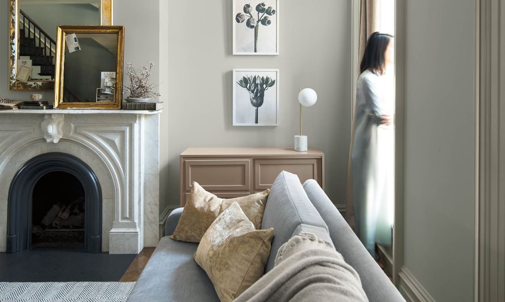
Benjamin Moore’s Metropolitan (AF 690)
A stylish, cool grey, Benjamin Moore’s Metropolitan AF 690 is a sophisticated neutral designed to be supported by the company’s Color Trends 2019, a coordinating palette of 15 harmonious hues.
“Metropolitan AF-690 emanates nuance, harmony, and extravagant ease. Always adaptable, it softens to matte or shimmers with sheen. It’s neutral. It’s understated. It just is. This is color, off-duty.”


Simpatico and Color by Numbers are two of our wall tile collections that offer a full palette of complementary neutrals and artsy accent colors designed for stylish mixing and matching. The Simpatico line includes dimensional selections that provide texture, shape, and shadow, while the Color by Numbers lineup has matching Benjamin Moore paint colors for exact, effortless color expressions from floor to ceiling.

Color By Numbers

Simpatico
While the colors of the year are always a surprise, we’re not resting on our laurels when it comes to forecasting the colors. Identifying design trends and understanding what’s happening in the world of color are driving forces behind our product development. You can depend on Crossville to answer the latest trends with up-to-the-minute looks for both residential and commercial interiors.